> ## Documentation Index
> Fetch the complete documentation index at: https://kalpi.ai/docs/llms.txt
> Use this file to discover all available pages before exploring further.
# Seasonality Analysis
> Analyze recurring historical return patterns and monthly market behavior across stocks and indices.
The **Seasonality Analysis** terminal analyzes the historical performance of any stock or index on a month-by-month basis. By plotting decades of market data, this tool helps you identify recurring seasonal patterns and gives you a statistical edge in your strategic timing.
## Analysis Modes
Using the toggle at the top right of the dashboard, you can seamlessly switch between two distinct research modes depending on your analytical needs.
* **Single Analysis:** Deep-dive into the historical seasonal trends of a single asset using the top search bar.
* **Compare Symbols:** Open a side-by-side split screen to compare the seasonal patterns of two different assets (e.g., NIFTY vs. HDFC Bank) simultaneously.
## Interpreting the Charts
The dashboard breaks down seasonality into two complementary charts that work together to give you a complete picture of an asset's historical character.
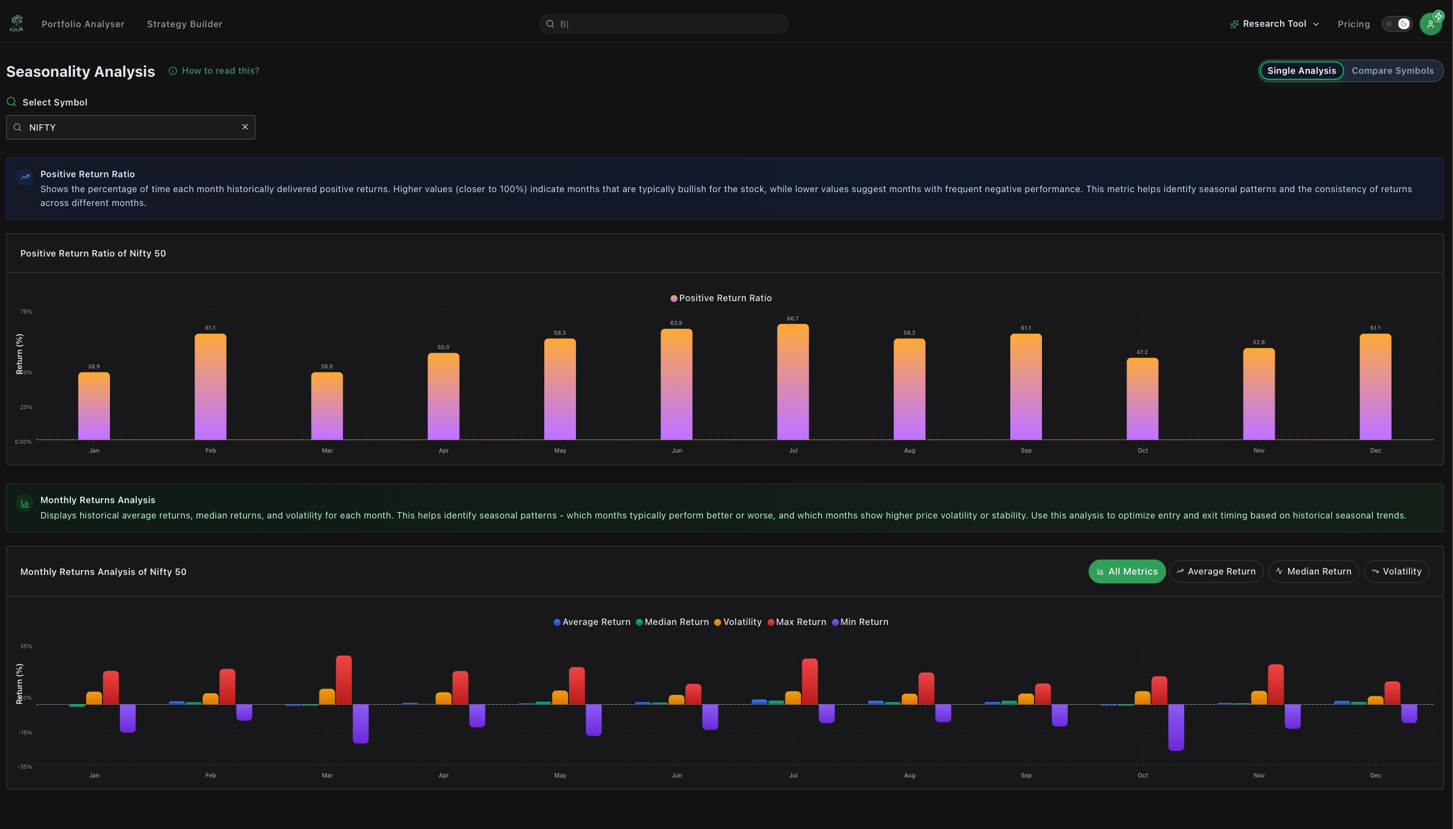 ### 1. Positive Return Ratio
This chart answers the question: *"How often is this month profitable?"*
It displays a clean bar chart showing the percentage of time each month historically delivered a positive return over the available history.
* A **high bar** (e.g., 68%) indicates a month that is historically reliable and consistent in generating positive returns.
* A **low bar** suggests a month with frequent negative performance and a lower probability of finishing in the green.
### 2. Monthly Returns Analysis
This chart answers the question: *"When this month is profitable (or not), by how much? And what is the risk?"*
Located directly below the ratio chart, this section provides a deeper look into the magnitude of those returns. You can click the filter buttons at the top of the chart to isolate specific metrics:
* **Average & Median Return:** Track the baseline historical gain or loss expected for that month.
* **Max & Min Return:** View the single best and single worst performance ever recorded for that month to understand maximum potential upside and downside.
* **Volatility:** Isolate this metric to see how wide the price swings have historically been. Higher volatility means wider price ranges and more systemic risk.
***
## Actionable Insights (Built-In Guide)
If you need a quick refresher on how to apply seasonality data to your trading, click the green **"How to read this?"** button next to the page title.
This opens a detailed side drawer containing strategic insights, such as:
* **Identifying High-Probability Setups:** Looking for months that feature both a high Positive Return Ratio (>60%) and a healthy positive Average Return.
* **Assessing the True Risk:** Avoiding "boom or bust" months where a high average return is skewed by massive historical volatility or extreme drawdowns.
* **Strategic Timing:** Tightening stop-losses or sizing down positions as you approach historically weak or volatile months.
### 1. Positive Return Ratio
This chart answers the question: *"How often is this month profitable?"*
It displays a clean bar chart showing the percentage of time each month historically delivered a positive return over the available history.
* A **high bar** (e.g., 68%) indicates a month that is historically reliable and consistent in generating positive returns.
* A **low bar** suggests a month with frequent negative performance and a lower probability of finishing in the green.
### 2. Monthly Returns Analysis
This chart answers the question: *"When this month is profitable (or not), by how much? And what is the risk?"*
Located directly below the ratio chart, this section provides a deeper look into the magnitude of those returns. You can click the filter buttons at the top of the chart to isolate specific metrics:
* **Average & Median Return:** Track the baseline historical gain or loss expected for that month.
* **Max & Min Return:** View the single best and single worst performance ever recorded for that month to understand maximum potential upside and downside.
* **Volatility:** Isolate this metric to see how wide the price swings have historically been. Higher volatility means wider price ranges and more systemic risk.
***
## Actionable Insights (Built-In Guide)
If you need a quick refresher on how to apply seasonality data to your trading, click the green **"How to read this?"** button next to the page title.
This opens a detailed side drawer containing strategic insights, such as:
* **Identifying High-Probability Setups:** Looking for months that feature both a high Positive Return Ratio (>60%) and a healthy positive Average Return.
* **Assessing the True Risk:** Avoiding "boom or bust" months where a high average return is skewed by massive historical volatility or extreme drawdowns.
* **Strategic Timing:** Tightening stop-losses or sizing down positions as you approach historically weak or volatile months.